library(tidyverse)

library(janitor)

library(gt)

library(car)

library(rstatix)

library(dplyr)

library(here)

library(MuMIn)

library(DHARMa)

library(ggeffects)

library(effsize)

library(ggplot2)

library(Hmisc)

kelp <- read_csv("../Data/Annual_Kelp_All_Years_20250903.csv")

mopl <- read_csv("../DATA/MOPL_nest-site_selection_Duchardt_et_al._2019.csv")

sleep_calendar <- read_csv("../data/sleep_schedule.csv") # read in project data as an object called sleep_calendarENVS-193DS_winter-2026_final
Problem 1. Research writing
a. Transparent statistical methods
In part 1, they used linear regression. We know this because the analysis examined whether a continuous variable (precipitation) can be used to predict another continuous variable (the extent of flooded wetland area).
In part 2, they used a Kruskal–Wallis test. This test evaluates whether the median flooded wetland area differs among several groups, in this case the five water year classifications (wet, above normal, below normal, dry, and critical drought) to determine if at least one group’s median is significantly different from the others.
b. Figure needed
A boxplot would be an appropriate figure to accompany the test in part 2 because it visually compares distributions and medians across multiple groups, which matches the goal of the Kruskal–Wallis test. On the x-axis I would have the 5 different water year classifications, while on the y-axis I would show the wetland flooding area. Each category on the x-axis would have its own boxplot representing the distribution of flooded wetland area values for that water year type. In each boxplot, there would be a horizontal line inside the box that represents the median flooded wetland area. The box shows the interquartile range, while whiskers would extend to the rest of the non-outlier data. This figure would help readers visually compare the medians and variability of flooded wetland area across the five water year classifications, providing clearer context for the statistical test.
c. Suggestions for rewriting
Part 1: Flooded wetland area in the San Joaquin River Delta did not show evidence of being predicted by precipitation. This suggests that differences in yearly precipitation were not linked to measurable changes in the extent of flooded wetlands in this dataset. (Linear regression, F(df) = [test statistic], p = 0.11, α = significance level).
Part 2: Flooded wetland area did not appear to differ across water year classifications, indicating that the median flooded wetland area was similar among the five water year categories in this analysis. (Kruskal–Wallis test: H = [test statistic], p = 0.12, α = significance level).
d. Interpretation
One additional variable that could influence flooded wetland area is river discharge (water flow) entering the delta. River discharge is a continuous variable, and higher flow rates could increase the amount of water entering wetlands, potentially expanding the total flooded area.
Problem 2. Data visualization
a. Cleaning and summarizing
kelp_clean <- kelp |> # store the kelp data in kelp_clean
  clean_names() |> # clean column names

  filter(site %in% c("IVEE", "NAPL", "CARP")) |> # Include observations from Isla Vista, Naples, and Carpinteria

  filter(!(date == "2000-09-22" & transect == "6" & quad == "40")) |> # removes observation

  mutate(site_name = case_when( # Create descriptive site_name based on site codes
  site == "NAPL" ~ "Naples", # change site name from NAPL to Naples
  site == "IVEE" ~ "Isla Vista", # change site name from IVEE to Isla Vista
  site == "CARP" ~ "Carpinteria" # change site name from CARP to Carpinteria
)) |>

mutate(site_name = as_factor(site_name), # converts site_name to a factor
       site_name = fct_relevel(site_name, # custom order for factor levels
                               "Naples", "Isla Vista", "Carpinteria")) |>

  group_by(site_name, year) |> # Group by site_name and year for summarizing
  dplyr::summarize(mean_fronds = mean(fronds)) |> # Calculate mean fronds per group
  ungroup() # Ungroup to remove grouping, giving data frame

kelp_clean |> slice_sample(n = 5) # slice 5 samples from the kelp_clean data frame
# A tibble: 5 × 3
site_name year mean_fronds
<fct> <dbl> <dbl>
1 Isla Vista 2022 38.3
2 Naples 2020 7.41
3 Naples 2005 10.2
4 Isla Vista 2023 3.78
5 Isla Vista 2010 4.78str(kelp_clean) # Show the structure of datasettibble [77 × 3] (S3: tbl_df/tbl/data.frame)
$ site_name : Factor w/ 3 levels "Naples","Isla Vista",..: 1 1 1 1 1 1 1 1 1 1 ...
$ year : num [1:77] 2000 2001 2002 2003 2004 ...
$ mean_fronds: num [1:77] 1.8947 0.0606 3.0111 9.2596 7.8141 ...b. Understanding the data
That observation was excluded because the fronds value for 2000-09-22 in transect 6, quad 40 is -99999, which is not an actual count but a message indicating missing or unrecorded data. The data catalog explains this in the Methods and Protocols tab on the data page, under the method’s section.
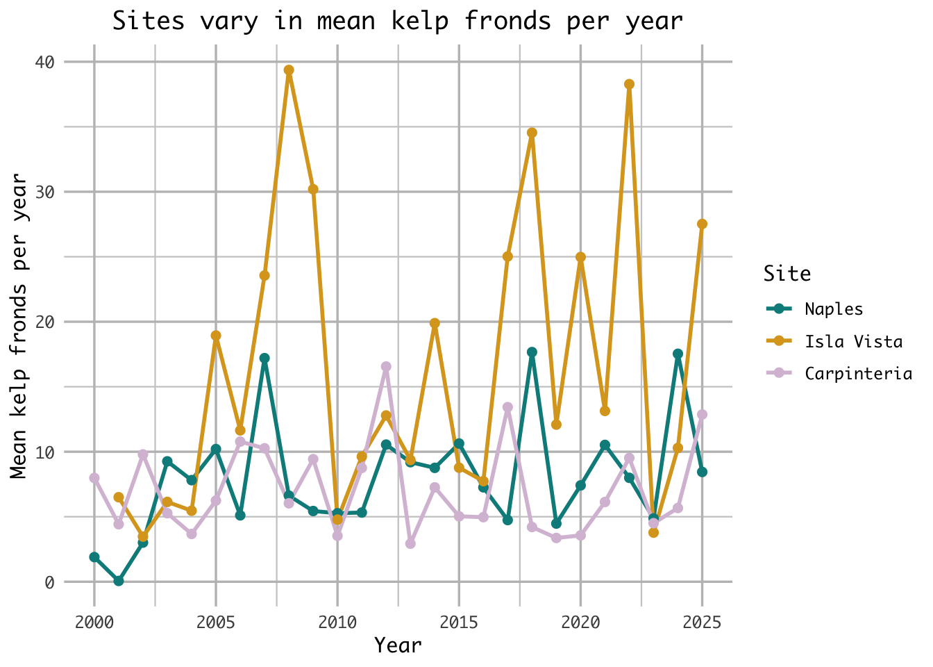
c. Visualize the data
ggplot(kelp_clean, # use the cleaned kelp dataset
       aes(x = year, # map year to x
                       y = mean_fronds, # map mean_fronds to y
                       color = site_name)) + # color point by site name

  geom_line(size = 1) + # line geometry
  geom_point(size = 2) + # point geometry

  scale_x_continuous( # customize the x-axis (continuous numeric axis)
    breaks = c(2000, 2005, 2010, 2015, 2020, 2025), # major tick marks shown on the axis
    minor_breaks = seq(2000, 2025, 2.5) # smaller tick marks every 2.5 years
  ) +

  scale_y_continuous(
    breaks = c(0, 10, 20, 30, 40), # major tick marks
    minor_breaks = seq(0, 40, 5) # smaller tick marks every 5 units
  ) +

  scale_color_manual(values = c(  # manually set the colors for the groups
    "Naples" = "darkcyan", # assign 'Naples' data to dark cyan color
    "Isla Vista" = "goldenrod", # assign 'Isla Vista' data to golden/yellow color
    "Carpinteria" = "thistle" # assign 'Carpinteria' data to light purple color
  )) +

  labs(
    title = "Sites vary in mean kelp fronds per year", # add title
    x = "Year", # label x axis
    y = "Mean kelp fronds per year", # label y axis
    color = "Site" # title for color grouping
  ) +

  theme_minimal(base_family = "Monaco") + # change theme to minimal and font to monaco

  theme(
    plot.title = element_text(hjust = 0.5), # center plot title
    panel.border = element_blank(), # remove border
    panel.grid.major = element_line( # customize major gridlines
      color = "grey75",
      linewidth = 0.6),
    panel.grid.minor = element_line( # customize minor gridlines
      color = "grey80",
      linewidth = 0.4)
  )
d. Interpretation
The site with the most variable mean kelp fronds per year is Isla Vista, as seen through its large fluctuations ranging from 4 to 40 mean kelp fronds per year. Additionally, Isla Vista’s fluctuation’s are more variable year over year than both Naples and Carpinteria with large increases and decreases in the mean kelp fronds as seen in years like 2006-2008 or 2022-2023.
The site with the least variable mean kelp fronds per year is Carpinteria, as seen through its comparitvely small fluctuations ranging only from 3-16 mean kelp fronds per year. While similar, Naples ranges to 16 mean kelp fronds per year 3 times, whereas Carpinteria only ranges that high once.
Problem 3. Data analysis
a. Response variable
In the data set 0s mean that a site within a prairie dog colony is unused and available, whereas a 1 means that a site is used as a Mountain plover nest site.
b. Purpose of study
Visual obstruction is a continuous variable, as it represents a numeric value representing vegetation height and density using a Robel pole. As visual obstruction increases, the probability of Mountain Plover nest site use would likely decrease because the species prefers areas with short vegetation and more open ground that allow better visibility of predators such as the environment seen at prairie dog colonies. The description of visual obstruction and the use of a Robel pole is found in the methods section, “Adult Mountain Plover Density – Data Collection,” third paragraph, whereas the justification of the decrease in probability of a nest is found in the discussion section, paragraph 4.
Distance to prairie dog colony edge is a continuous variable because it represents a numeric distance from a nest site to a prairie dog colony. As the distance to prairie dog colony edge increase, the probability of Mountain Plover nest site use would decrease because prairie dog colonies provide the environment that Mountain Plovers prefer by shortening the vegetation on areas with open ground. The information was found in the discussion section, paragraph 3.
c. Table of models
| Model number | Visual Obstruction | Distance to Prarie Dog Colony | Model Description |
|---|---|---|---|
| 0 | N | N | no predictors (null model) |
| 1 | Y | Y | all predictors (saturated model) |
| 2 | N | Y | Distance to colony edge only |
| 3 | Y | N | Visual obstruction only |
d. Run the models
mopl_clean <- mopl |>
  clean_names() |> # clean column names
  mutate(used_bin = case_when(id == "used" ~ 1, # mutate collumn "used" = 1, "available" = 0
                              id == "available" ~ 0)) |>
  select(used_bin, edgedist, vo_nest) # keep only needed columns

m0 <- glm( # fit a generalized linear model
  used_bin ~ 1, # null model (no predictors)
  data = mopl_clean, # use mopl_clean data set
  family = "binomial" # logistic regression for nest used (1) or not used (0)
)

m1 <- glm( # fit a generalized linear model
  used_bin ~ vo_nest + edgedist, # saturated model (all predictors)
  data = mopl_clean, # use mopl_clean data set
  family = "binomial" # logistic regression for nest used (1) or not used (0)
)

m2 <- glm( # fit a generalized linear model
  used_bin ~ edgedist, # Distance to colony edge predictor
  data = mopl_clean, # use mopl_clean data set
  family = "binomial" # logistic regression for nest used (1) or not used (0)
)

m3 <- glm( # fit a generalized linear model
  used_bin ~ vo_nest, # Visual obstruction predictor
  data = mopl_clean, # use mopl_clean data set
  family = "binomial" # logistic regression for nest used (1) or not used (0)
)
e. Select the best model
AICc(m0, m1, m2, m3) |> # calculate AICc values for all four models
  arrange(AICc) # sort models from lowest (best) to highest AICc
df AICc
m3 2 331.8130
m1 3 333.8293
m0 1 384.6318
m2 2 386.1351The best model as determined by Akaike’s Information Criterion (AIC) is the model which used visual obstruction as the only predictor variable to the probability of site usage by Mountain Plover nests.
f. Check the diagnostics
sim_res_m3 <- simulateResiduals(fittedModel = m3) # simulate residuals for the best model "m3" and store as sim_res_m3
plot(sim_res_m3) # create plot of residuals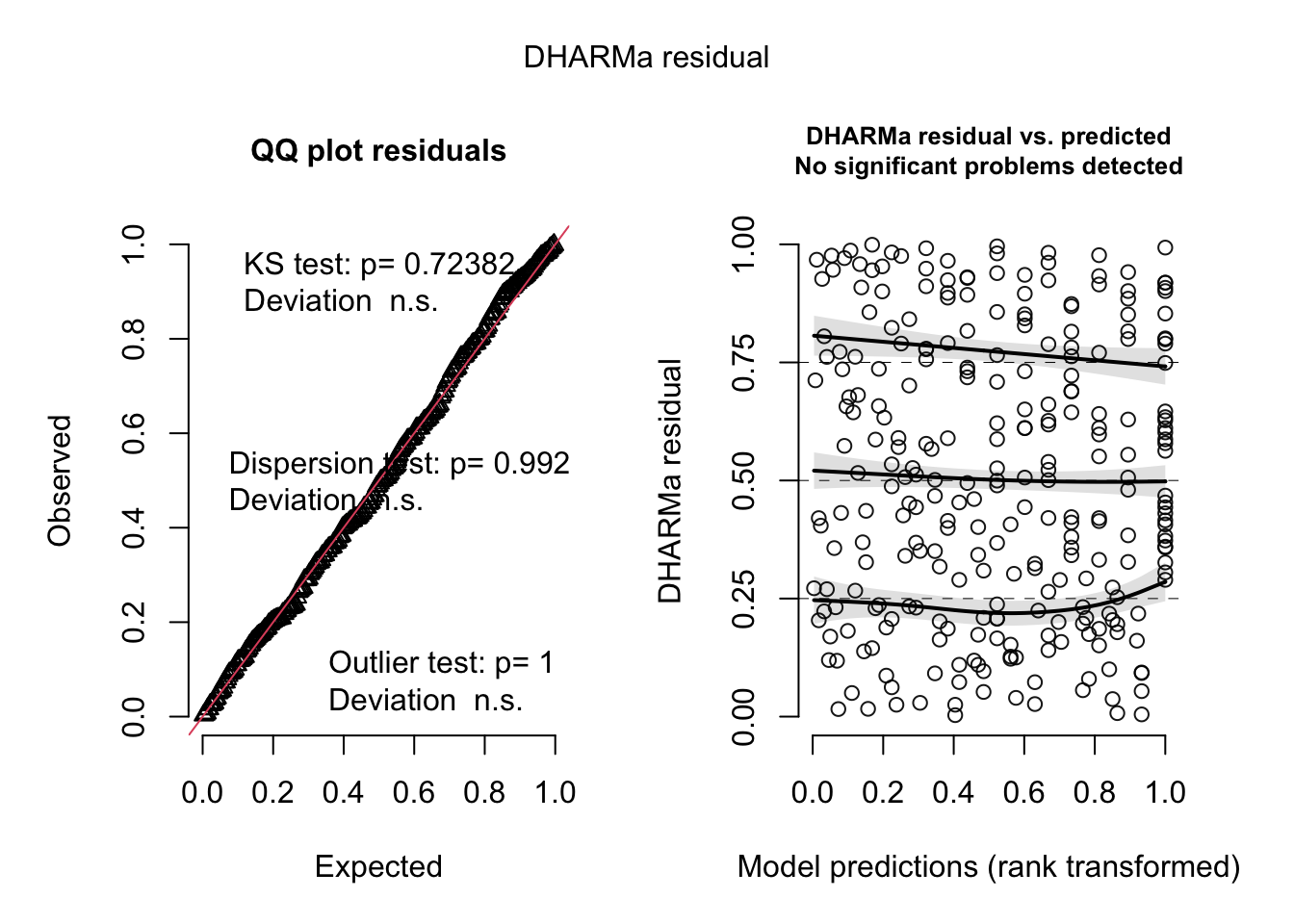
g. Visualize the model predictions
predict_data_m3 <- ggpredict(
  m3, # generate predicted values from model m3
  terms = "vo_nest" # for the predictor variable vo_nest
)

ggplot(data=mopl_clean, # use mopl_clean dataset
       aes(x = vo_nest, # set vo_nest as x-axis
           y = used_bin)) + # set used_bin as y-axis
  geom_point( # plot observed points
    color = "blue", # edit line color
    alpha = 0.5 ) + # edit point transparency

  geom_ribbon(data = predict_data_m3, # add confidence interval
              aes(x = x, # set x to x-axis
                  y = predicted, # set predicted values to y-axis
                  ymin = conf.low, # set lower bound CI
                  ymax = conf.high), # set upper bound CI
              fill = "skyblue", # edit fill color
  ) +
  geom_line(data = predict_data_m3, # add prediction line
           aes(x = x,
               y = predicted),
           color = "red" # edit line color
  ) +
  labs(
    x = "Visual Obstruction (cm)", # x-axis label
    y = "Probability of Mountain Plover nest site use (Yes = 1, No = 0)" # y-axis label
  ) +
  theme_classic() # change theme to classic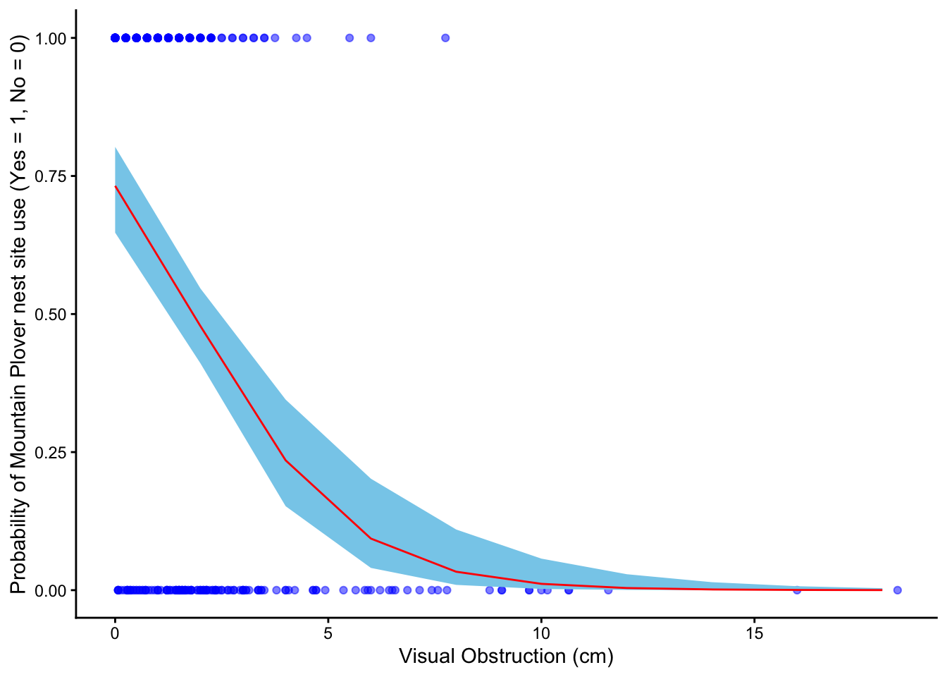
h. Write a caption for your figure
Figure 1. Predicted probability of Mountain Plover nest site use in relation to visual obstruction.
Blue points show observed nest site use (0 = unused, 1 = used) across levels of visual obstruction (cm). The red line represents predicted probabilities from the selected logistic regression model, and the light blue shaded ribbon indicates the 95% confidence interval around those predictions. Data collected by Duchardt, Courtney; Beck, Jeffrey; Augustine, David (2020). Data from: Mountain Plover habitat selection and nest survival in relation to weather variability and spatial attributes of Black-tailed Prairie Dog disturbance [Dataset]. Dryad.
i. Calculate model predictions
ggpredict(m3, # use the selected logistic regression model
          terms = "vo_nest [0]") # set visual obstruction value to 0
# Predicted probabilities of used_bin
vo_nest | Predicted | 95% CI
--------------------------------
0 | 0.73 | 0.65, 0.80j. Interpret your results
Figure 1 shows that the probability of Mountain Plover nest site use declines as visual obstruction increases, indicating that plovers prefer areas with more open ground. There is a clear negative relationship between vegetation height and the likelihood that a site will be used for nesting. When visual obstruction is zero, the predicted probability of a site being used for nesting is about 0.73. This pattern likely reflects the plovers’ need for unobstructed sight lines to detect predators and monitor their surroundings. Additionally, open areas may provide easier access to food and safer conditions for raising chicks, making sites with taller or denser vegetation less suitable for nesting.
Problem 4. Affective and exploratory visualizations
a. Comparing visualizations
The exploratory visualizations I made represent the data in a standard, quantitative way using axes, scales, and precise numeric values, making it easy to identify exact relationships and patterns between variables. In contrast, my affective visualization (the tree) represents the data more metaphorically, using shape like branch length and what side of the tree to evoke an intuitive, emotional understanding of sleep patterns rather than precise measurements.
Between the exploratory and affective visualizations, there is simularities between the groupings of the data. Due to the way the affective visualization was created, it was easy to see the groupings of points seen in my exploratory data in the branches. As a result, you can visualize the shape of the tree when looking at the plots and see where the tree’s shape came from.
The first half of the week of my exploratory visualization shows sleep duration tightly clustered around 8–8.5 hours, while the second half has a wider range with more variability above and below that range. This same pattern appears in the affective visualization, where the left side of the tree is more uniform and the right side has more irregular, uneven branches. These patterns are consistent across visualizations because they represent the same underlying data, but the scatterplot shows variability quantitatively while the affective visualization shows it more intuitively through shape.
Some feedback that I got on my visualization is to reduce the amount of variables I represent in my visualization. Originally I intended to represent my resting heart rate for the data through leaf color, changing the shade to indicate increased heart rate. I ended up taking the feedback and focusing on just sleep duration and the half of the week, as I felt that while heart rate might impact duration I wanted to focus on the story of how weekly activities impact sleep.
- Designing an analysis
One analysis that we talked about this quarter that I could apply to answer my research: “Is there a significant difference in mean sleep duration between the first half and second half of the work week?” is a students two sample t-test. This analysis is appropriate with regard to my variables because in my study I address two variables, the half of the work week and sleep duration. The half of the work week is my predictor variable, which is a categorical variable split into two independent parts; the first half of the week and the second half of the week. Comparatively my response variable, Sleep duration (hrs), is a continuous variable.
A student’s two sample t-test is appropriate for my data because it allows me to compare a continuous response variable like sleep duration between two independent groups (the first half vs. the second half of the work week). I would choose a test like a student’s two sample t-test because while my sleep duration data is continuous and normal with mostly independent samples, with roughly equal variances.
- Check any assumptions and run your analysis Cleaning Data:
sleep_calendar_clean <- sleep_calendar |>
  clean_names() |> # clean column names to make them lower_case_with_underscores
  select(duration_hr_mm_ss, half_of_week) # keep only two collumns
Assumptions: 1. Continuous variable: Our response variable, sleep duration, is continuous because it’s measured in hours and can take any numeric value, not just fixed categories.
Independent samples: Our predictor variable, the half of the work week, has two independent groups because each night’s sleep measurement belongs to either the first half of the week (Monday/Tuesday) or the second half (Wednesday/Thursday), but not both. No single observation appears in both groups, so the sleep duration in one group do not influence or overlap with the other group.
Data is normally distributed: Yes it is normally distributed.
ggplot(data = sleep_calendar_clean |>
         filter(half_of_week != 3) |>  # use sleep_calendar data frame but exclude the weekend
       mutate(duration_hr = as.numeric(duration_hr_mm_ss) / 3600), # convert seconds to hours
       aes(sample = duration_hr, # use hours for QQ plot
           color = half_of_week)) + # color points by half_of_week
  geom_qq_line(color = "blue") + # add reference line in blue
  geom_qq() + # add plot points
  facet_wrap(~ factor(half_of_week, # convert half_of_week into a categorical factor
                      levels = c(1,2), # define the order of the categories
                      labels = c("Mon/Tues", "Wed/Thurs"))) + # label panels as Mon/Tues and Wed/Thurs
  theme(legend.position = "none") # remove legend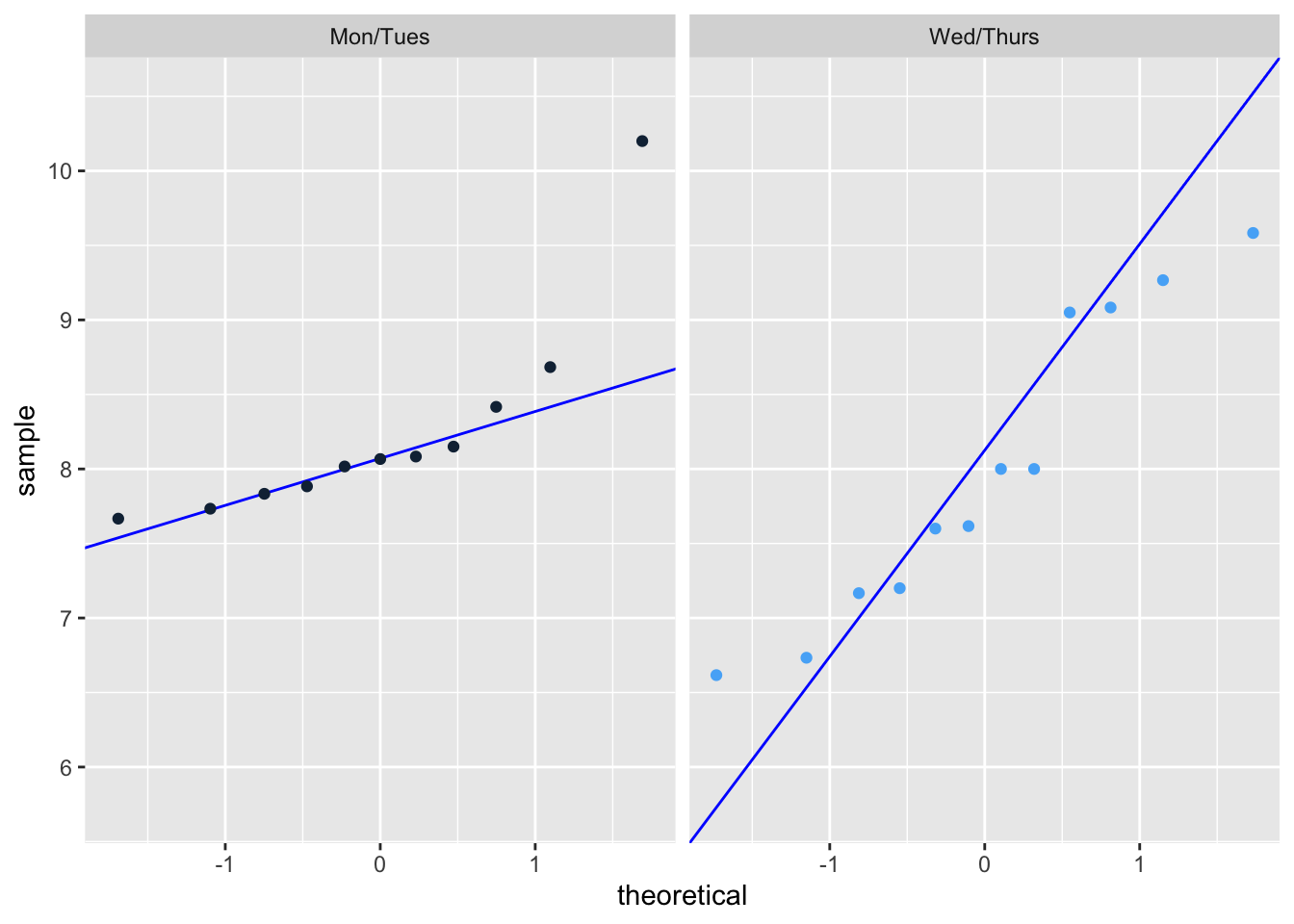
Random samples: Strictly speaking, the random sample assumption is not met because my data is tailored to a single individual and not randomly sampled from a population. However, for a personal experiment such as this the test will work, I simply cannot generalize the results to other people or populations.
Equal variances: Our p-value is greater than 0.05, which means there is no statistically significant evidence that the variances are different.
var.test(duration_hr_mm_ss ~ half_of_week, # run variance test between first half and second half of the week
         data = sleep_calendar_clean %>% filter(half_of_week != 3)) # exclude weekend
    F test to compare two variances

data:  duration_hr_mm_ss by half_of_week
F = 0.48197, num df = 10, denom df = 11, p-value = 0.2606
alternative hypothesis: true ratio of variances is not equal to 1
95 percent confidence interval:
 0.1367043 1.7663956
sample estimates:
ratio of variances
         0.4819746
Run analysis
t.test(as.numeric(duration_hr_mm_ss) ~ half_of_week,  # run a two-sample t-test
       data = sleep_calendar_clean %>% filter(half_of_week != 3), # exclude the weekend
       var.equal = TRUE)  # assume equal variances
    Two Sample t-test

data:  as.numeric(duration_hr_mm_ss) by half_of_week
t = 0.68814, df = 21, p-value = 0.4989
alternative hypothesis: true difference in means between group 1 and group 2 is not equal to 0
95 percent confidence interval:
 -1859.391  3698.482
sample estimates:
mean in group 1 mean in group 2
       29694.55        28775.00
Effect Size:
sleep_two_groups <- sleep_calendar_clean |>
  filter(half_of_week != 3) |> # exclude the weekends
  mutate(duration_hr = as.numeric(duration_hr_mm_ss)/3600, # convert sleep duration from seconds to hours
         half_of_week = factor(half_of_week, # convert half_of_week into a categorical factor
                               levels = c(1,2), # define the order of the categories
                               labels = c("Mon/Tues", "Wed/Thurs"))) # add labels

cohen.d(duration_hr ~ half_of_week, # compare average sleep duration between the two half-of-week groups
        data = sleep_two_groups, # use filtered and mutated dataset
        pooled = TRUE)  # assume equal variances, use combined SD from both groups for Cohen's d
Cohen's d

d estimate: 0.2872462 (small)
95 percent confidence interval:
     lower      upper
-0.5852903  1.1597827
d. Create a visualization
ggplot(data = sleep_calendar_clean |> # use sleep_calendar_clean data frame
         filter(half_of_week != 3), # exclude weekends from visualization
       aes(x = factor(half_of_week, # convert half_of_week to categories
                      levels = c(1,2),
                      labels = c("1st Half", "2nd Half")), # add labels for x-axis
           y = duration_hr_mm_ss, # add labels for y-axis
           color = factor(half_of_week,
                          levels = c(1,2),
                          labels = c("1st Half", "2nd Half")))) + # color points by half_of_week categories
  stat_summary(fun = mean, # calculate the mean of y values for each group
               geom = "point", # display the mean as a point on the plot
               size = 4, # change size
               color = "black") + # set mean color to black
  stat_summary(fun.data = mean_cl_normal, # calculate mean and confidence limits
               geom = "errorbar", # show as error bar
               width = 0.2, # change width
               color = "black") + # set errorbar color to black
 geom_jitter(width = 0.15, # change width
              size = 3, # change size of points
              alpha = 1, # alter transparency
              shape = 21, # shape that supports fill + outline
              stroke = 0.8, # thickness of black outline
              fill = "white") + # inner fill color
  scale_color_manual(values = c("1st Half" = "darkblue",
                                "2nd Half" = "red")) + # set custom colors by category
  labs(
    title = "Sleep Duration Changes Between Parts of the Week", # add title
    subtitle = paste("Most recent observation:", "Thursday, Mar 5, 2026"), # add subtitle
    x = "Half of the week (Mon/Tues, Wed/Thurs)", # label x axis
    y = "Sleep Duration (hours)", # label y axis
    color = "Section of the Week" # label legend
  ) +
  theme_light() # change theme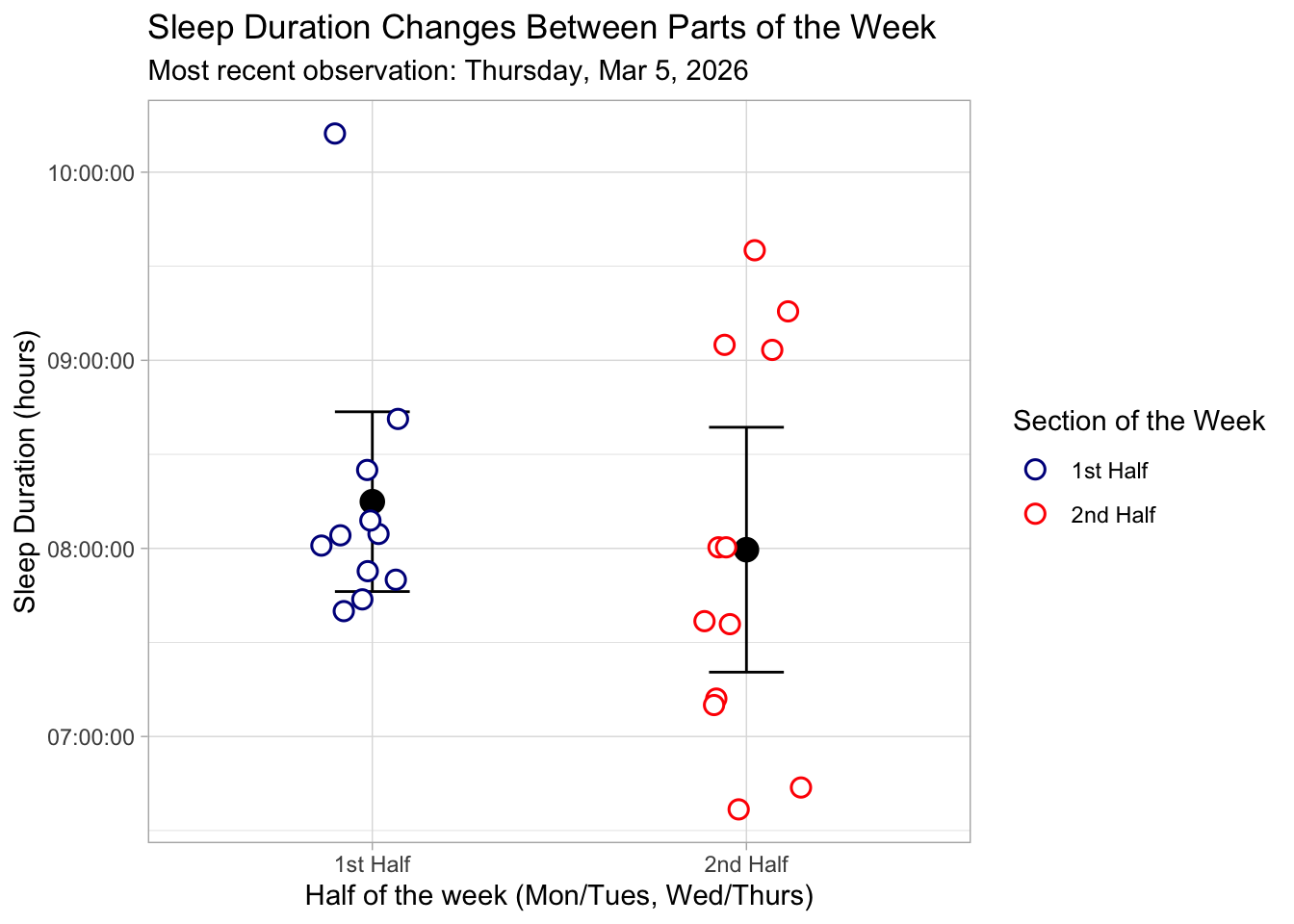
e. Write a caption
Figure 1. Sleep Duration Across the First and Second Halves of the Week. This figure displays individual sleep duration measurements (in hours) for the first half of the week (Monday/Tuesday) and the second half of the week (Wednesday/Thursday). Each data point is represented by a white-filled circle with a colored outline and slight horizontal jitter to prevent overlap. Points are colored by week section: dark blue for the first half and red for the second half. Black points indicate the mean sleep duration for each half of the week, with vertical black error bars representing the 95% confidence interval around the mean. The plot uses a light theme for readability, with labeled axes and a descriptive legend indicating the section of the week.
f. Write about your results
There was no statistically significant difference in mean sleep duration between the first half (Monday/Tuesday) and second half (Wednesday/Thursday) of the work week (Student’s two sample t-test, t(21) = 0.69, p = 0.50, α = 0.05 ). The average sleep duration was higher in the first half of the week (mean = 8.25 hr) compared to the second half (mean = 7.99 hr), but this difference was small. (0.26 hrs longer, 95% CI : [-0.52, 1.03] hrs). The effect size was also small (Cohen’s d = 0.29), indicating that the practical difference in sleep duration between the two halves of the week is minimal. These results suggest that, for myself, sleep duration remains relatively consistent across the work week.